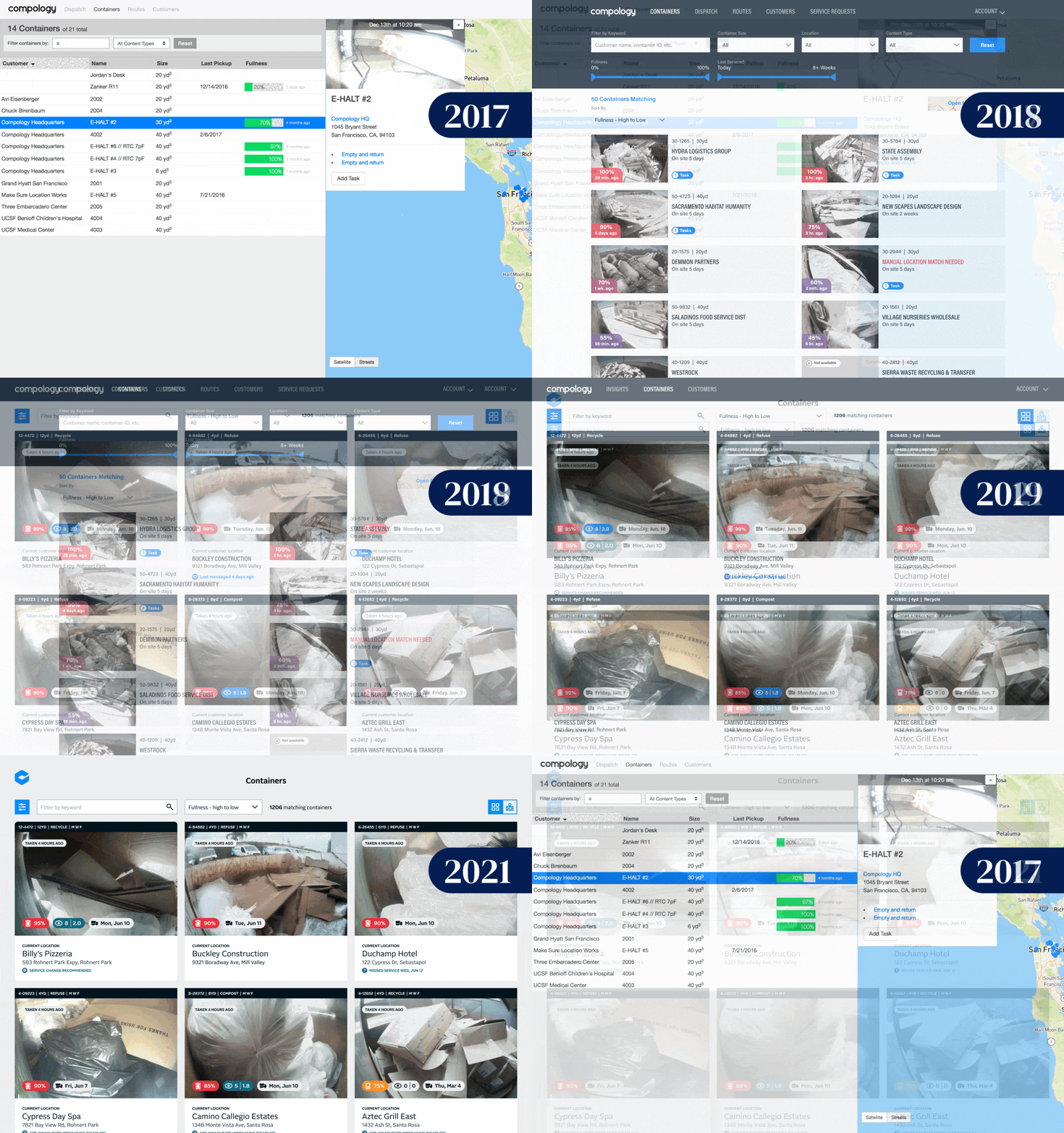
Evolution of the Containers Page
Compology
-
Role
I led product design, user research and visual design.
-
Timeline
The containers view went through three major iterations over the five years I was with Compology.
-
Tools
Figma
UserZoom Go
What is the containers view?
One of the core pages of the Compology product
It shows the current data for all sensors that are installed on a dumpster/container
Started with just images, fullness and location. Evolved to include contamination, last service data, operational alerts and rightsizing recommendations
This is where many users spent a majority of their time
Used to find and filter down to a subset of containers that needed action taken, to proactively check status of a container or to reactively check information provided by a customer
Iteration #1
Problems to Solve
Inconsistent branding throughout the entire application. This was the most used page, so we decided to roll out updated design and branding here first.
Customers wanted to see container photos for all containers
Customers wanted to see larger photos
Customers wanted more advanced filtering. Users were hauling roll-off containers that were on an on-call schedule. They wanted to filter down to the fullest containers or the containers that had been on a site for the longest
Customers didn't use the map portion of the UI very often
Opportunities and Goals
Card structure that allowed for thumbnail images
Advanced filtering that helped users with specific use cases
A view of each container that showed more detailed container and location information, as well as dynamic feature widgets based on customer segment
Design Process
Two rounds of wireframes
User interviews
High-fidelity design
Live beta version of the page
User beta program
Final release to all users
Results
Card-based design that allowed for showing thumbnail images for all containers
Area for multiple alert flags
Use of color to indicate fullness reading of container
Separate map view to allow default view to show as many containers as possible
Advanced filtering by location, fullness and most recent service
Iteration #2
Problems to Solve
Additional data needed on cards that didn't fit into current components
Customers wanted to see larger thumbnails for easy scanning
Location address was important
Additional filters were making the current filtering layout take up too much room
Opportunities and Goals
Component structure that could be added to/expanded as we rolled out future features on the roadmap
More advanced filtering that could be expanded as additional features were rolled out and new filtering use cases arose
A view of each container that showed more detailed container and location information, as well as dynamic feature widgets based on customer segment
Design Process
Two rounds of wireframes
User interviews
High-fidelity design
Usability testing
Final design release
Final Design
Updated card design that allowed for larger thumbnail images and more containers within one view
Updated map view that filtered containers base on map bounds
Moved filters to filter panel to allow additional filters to be added and to give room to expand
Iteration #3
Problems to Solve
We went through a re-brand and needed to updated the web-application to match the new branding assets and style
We had limited resources and time to complete this visual overhaul for the entire web-application
Opportunities and Goals
Make the web-application consistent with the new brand, without fundamentally changing the layout
Update fonts and colors
Design Process
Multiple high-fidelity design options
Usability testing
Marketing and product sign-off
Final design release

